29 Jan 2015

Mid-Point Drafting


Here I have started to create a rough layout for the different pages I intend to create as a part of my final. I have also included the different styles of colour and shading that I will be using throughout my work. Also I have started to sketch some designs for the fox character in the children's book I hope to create, I will work on these ideas to help create a look for my main character.


Here I have started to create the introduction page by looking back to my storyboard and what I had decided to include on this page. I started by sketching out the three characters that would be wearing the different uniforms and then lined them within the guides I made earlier. I then drew out the poppy the would be on the opposite page and centred it using the guides.

At this point I had started to do this process with each of the pages, Adding in some of the character details and silhouettes, ready for when I start to add the backgrounds and text to the pages.


20 Jan 2015

Character Drafting 'Foxy'


Using the initial drawings from my sketchbook I made a number of drawings of the main character of my book. I have drawn him in a number of different poses so I could just take these images and place them into the book. That way I wouldn't have to re-draw them each time. I also tested out the colouring style I used in my Mid-point Drafting and have decided that it would work well in a children's book as a child would feel comfortable seeing it, as they could have painted it.

16 Jan 2015

Copy - Lord Frith (Watership Down)


For my first copy I have chosen to take a scene from the beginning of the 1987 film, Watership Down. I have chosen this as I love the style of the animation and the way that it works well with the story telling at the start of the film.

~~~~~~~~~~~~


To collect the image that I needed for my copy, I opened the film on my laptop and played it through until I found the right scene for my copy. I then took a screenshot and saved it to my desktop.


I then took the image that I saved into Photoshop and started to select the region for cropping the image down.


And when I was happy I cropped the image so it only showed the image from the film. Then using this image I started to create my copy. First I took samples of the different colours used by using the eye dropper tool and created a mark on a separate layer with each colour and organised them, so colours used together or overlapping would be grouped on this layer.


~~~~~~~~~~~~

Here are some screenshots showing the different stages of coping the image:


~~~~~~~~~~~~

And here it is! The Final Piece!


25 Nov 2014

Scene Design 1


    WIP 1


Based on my scenery thumb-nail sketches, I made a colour WIP (work in progress) on Photoshop to get an idea of the colours and positioning. After this I started to test different brush styles that I felt would work well for this image. I ended up settling on paintbrush-style Photoshop Brushes.


I used an angled brush from 'Calligraphy Brushes' to create the first WIP, as it was only to show what colours I will be using and to show the layouts of the different parts of the scene. I also used 'Wet Media Brushes' and 'RealisticPencilBrushes' for my second WIP (below).

  WIP 2


I then used various paintbrush style Photoshop Bushes to add more detail to the colours on the ground and the trees. When I was happy with this colouring, I then worked on the metal in the trenches that are holding back the earth. I'm still not completely happy on how that turned out so if I decide to use this image in my finals, I will try different brush styles to make it more realistic.

   FINAL(ish)

(sorry if image doesn't load, the internet is being a poop today)

25 Oct 2014

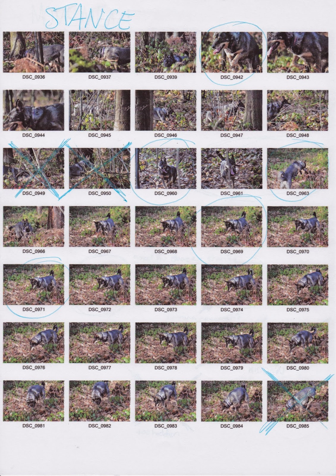
Contact Sheets


As a part of my development I went out and took photos of my pet dog in the local wooded area to help with designing the fox character.

22 Oct 2014

Scamps (Others Works)


Here I have created a number of quick rough sketches of various children's books to help with research into different themes and styles that reoccur. All of the original covers and illustrations I have collected on my Similar Artefacts Pinterest board. I hand drew these in pencil and then scanned them into Photoshop to bring up the colours and make them clearer.

13 Oct 2014

Aspect to Aspect


These 4 images where what I was working from to create my initial ink drawings... I 'inked' the different tones in the images as well as the different colours that stood out. I created five different ink sheets that I then scanned onto the computer and put onto photoshop. Next I changed the levels of the scans and removed the white background from each of the different inks.


After this I individually took the layers and started to add them together and changing the colours... I did this with all the layers and images, to create the finished pieces below.


9 Oct 2014

My Top Trump Card


This is my personal Top Trump card, I made it using the template but changed the details to suite me. I created the art for the card before hand but I changed the original text on the sign to something more suitable for the work. FACT: This card actually did have 56 spelling mistakes throughout it, the extra 0.37point2 is a silly reference to a pair of YouTubers.


8 Oct 2014

Adobe Top Trump Cards


As an addition to my personal Top Trump Card, I also created three other cards for the Adobe Programs I use the most in Graphics - Photoshop, InDesign and Illustrator. The images I used for the cards are the app/shortcut images with a darker version of the main colour used but the program. i.e.- Photoshop = Blue, InDesign = Pink, Illustrator = Orange.